

It’s an incredibly popular figure for teaching and communicating about earthquakes—so popular that you’ve very likely seen it a classroom, presentation, or news article. The figure “How Often do Earthquakes Occur?” links earthquake magnitude with both how often different-sized earthquakes occur and how much energy they release. Recently, questions from users prompted us to take a fresh look at the figure and the data behind it. In reviewing the many versions that have circulated over the years, we realized it would be a good idea to re-examine and clarify certain elements of it.
Luckily, we had help with this effort. We’re grateful to our Engagement Activities Advisory Committee, including Washington University in St. Louis Professor Michael Wysession, as well as University of Lausanne Professor György Hetényi, who volunteered to assist after contacting us with his own questions about the figure. Thanks to their collaboration, we’re excited to release a new and improved version of the figure, along with an accompanying fact sheet, which you can find here.
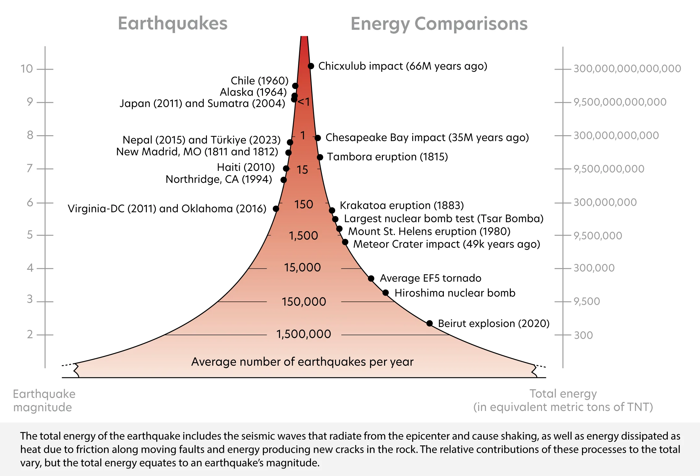
The update centers around a change to the right-side axis, which compares the energy released by earthquakes with well-known natural and human-made events, such as volcanic eruptions and nuclear explosions. The original TNT-equivalent energy metric could refer only to the seismic wave energy that radiates away from an earthquake—an intuitive reference point—but that introduces a tricky problem. Two magnitude 5.0 earthquakes can produce significantly different amounts of seismic wave energy.
For a cleaner comparison, the revised figure instead uses total energy. Unlike seismic wave energy, the total energy of an earthquake—adding in frictional heat on the fault surface and the formation of new cracks—is pretty consistent for a given magnitude. As a result of this change, the TNT-equivalent values on the right-side axis have increased substantially, causing the comparison events used previously to shift downward and necessitating the addition of new comparison events for the highest values.
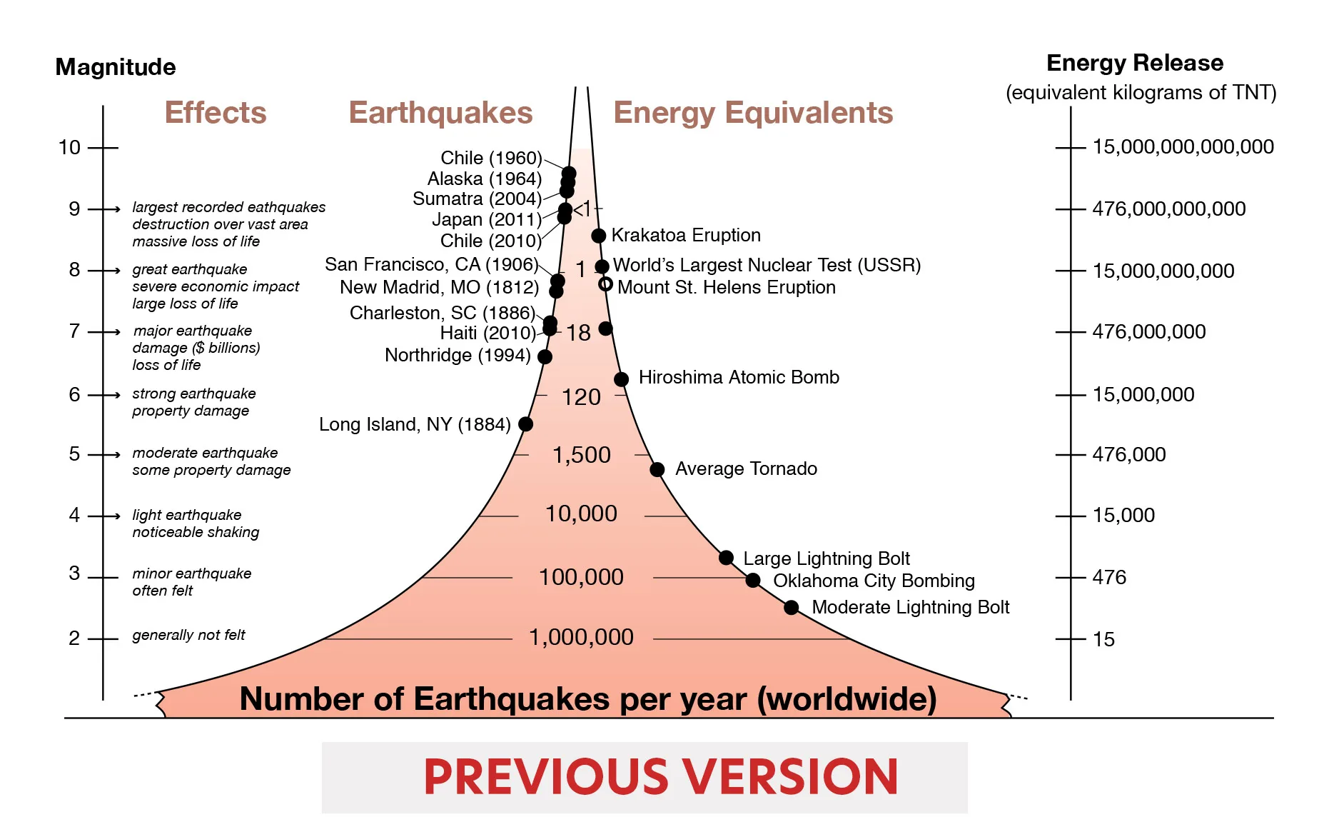
Compared to a previous version of the figure (above), other changes to the updated version included some visual simplification, a new selection of historical earthquakes, and standardization of the frequency of earthquakes of each magnitude.
If you’ve been using this figure in your teaching, consider replacing it with the updated version. Like all of our educational materials, it is free to use!